
What’s the deal with all these numbers? Accuracy, Precision, Recall, Sensitivity, AUC and ROCs.
The basic stuff:
Given a method that produces a numerical outcome either catagorical (classification) or continuous (regression), we want to know how well our method did. Let’s start simple:
True positives (TP): You said something was a cow and it was in fact a cow – duh.
False positives (FP): You said it was a cow and it wasn’t – sad.
True negative (TN): You said it was not a cow and it was not – good job.
False negative (FN): You said it was not a cow but it was a cow – do better.
I can optimise these metrics artificially. Just call everything a cow and I have a 100% true positive rate. We are usually interested in a trade-off, something like the relative value of metrics. This gives us:
Accuracy: Accuracy is about the truth:
However, we should be careful I can get a really high accuracy if my data contains an imbalance of positives or negatives. In fact, the baseline accuracy is equal the proportion of positives in your dataset!
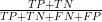
Precision: How many thing I say are cows are actually cows? Or more formally

Recall: How many cows are called cows?

You can combine precision and recall into a score called the F1-Score using their harmonic mean (remember harmonic means are appropriate for rates).
You may have heard of sensitivity, which is another word for recall. Specificity is rate of true negatives. The big thesaurus is here: https://en.wikipedia.org/wiki/Precision_and_recall
The less basic stuff
We can report ROC (receiver-operator characteristic) curves. This plots the FPR against the TPR – the extra R is for rate. A curve above the diagonal indicates better than random. The higher the curve the better the method. Often it a waste of ink though, with all the key information bunched up and lots of unused white space. Instead we could report the area under this curve (AUC). This has a nice interpretation: the AUC is the probability that the classifier will rank a randomly selected true positive higher than a randomly selected true negeative. It maybe clear from this interpretation that if there are lots of true positives or negatives the AUC can be inflated.
The precision-recall curves plots the precision against recall (obviously). The higher the curves against the negative diagonal the better. Again they suffer the same visual issues as a ROC curves. Again the AUPRC can be interprete as the average precision (over all values of recall). However, it has similar issues to ROC curve because it ignores true negatives.
The problem with these approaches is they only care about average performance and do not take into account the practical value of incorrect/correct answers. The way around this is report these metric for a range of practical values of concern. For example, what is the AUC only upto the 1% false positive rate. What is the precision for a recall equal to 0.1. A practical value is application specific (sorry you have to think!).
The hard stuff (technical)
When we are considering making prediction, we should think of assigning a score, S, to those predictions. A score tell us how good those predictions are, example of scores are the log-score (related to entropy/likelihood), Brier score (related to quadratic loss and mean squared error), and the spherical score etc. The score depends on what you are interested in: err on the side of caution you go for the log-score; can be a bit liberal you choose the spherical score. There’s no perfect metric – you have to think about what’s valuable to you (or your field) to pick the correct score. I’ll leave the technicalities to wikipedia (https://en.wikipedia.org/wiki/Scoring_rule).
A metric check list
Here’s a checklist for reporting metrics to determine whether your method is better:
- Report multiple performance metrics and be clear about imbalance in your data.
- Report metrics that are appropriate for your problem.
- Report ranges for performance metrics.
- You can subsample/perturb your test data or training data to get an idea of uncertainty.
- Explain what your range means – how did you make those errors bars?
- Avoid diochotimsing your predictions – evaluate on the real scale.
- Compare to a baseline.
- Good baselines are hard but random predictions, weighted averages are the place to start.
- Avoid metrics that capture average performance – quote values of practical interest
- Intepret your performance gains in words.
- If generalisation is important – evaluate on carefully contrusted test sets.
- Check the calibration of your forcasts if they come with scores.
- Be careful with approaches such as expected calibration error that only reports an average result.
- Report calibration at practical levels of interest.
- Be careful with metrics that are difficult to interpret and may not evaluate what you want
- Looking at you AIC, BIC, DIC, MDL, learning curves, elbow method, silhoutte, Dunn Index, R2
- There is no harm in evaluating on simulated data:
- Pathologies are clearest when you know everything.