Last week I wrote a post on some of the methods I use in python to efficiently process very large datasets. You can find that here. Roughly it details how one can break a large file into chunks which then can be passed onto multiple cores to do the number crunching. Below I expand upon this, first creating a parent class which turns a given (large) file into chunks. I construct it in a manner which children classes can be easily created and tailored for specific file types, given some examples. Finally, I give some wrapping functions for use in conjunction with any of the chunkers so that the chunks can be processed using multiple cores.
First, and as an aside, I was asked after the previous post, at what scale these methods should be considered. A rough answer would be when the size of the data becomes comparable to the available RAM. A better answer would be, when the overhead of reading each individual line(/entry) is more than the operation on that entry. Here is an example of this case, though it isn’t really that fair a comparison:
>>> import timeit,os.path
>>> os.path.getsize("Saccharomyces_cerevisiae.R64-1-1.cds.all.fa")
10095955
>>> timeit.timeit('f = open("Saccharomyces_cerevisiae.R64-1-1.cds.all.fa");sum([l.count(">") for l in f])',number=10)
0.8403599262237549
>>> timeit.timeit('f = open("Saccharomyces_cerevisiae.R64-1-1.cds.all.fa");sum([c.count(">") for c in iter(lambda: f.read(1024*1024),"")])',number=10)
0.15671014785766602
For a small 10MB fasta file, we count the number of sequences present in a fifth of the time using chunks. I should be honest though, and state that the speedup is mostly due not having the identify newline characters in the chunking method; but nevertheless, it shows the power one can have using chunks. For a 14GB fasta file, the times for the chunking (1Mb chunks) and non-chunking methods are 55s and 130s respectively.
Getting back on track, let’s turn the chunking method into a parent class from which we can build on:
import os.path

class Chunker(object):

    #Iterator that yields start and end locations of a file chunk of default size 1MB.
    @classmethod
    def chunkify(cls,fname,size=1024*1024):
        fileEnd = os.path.getsize(fname)
        with open(fname,'r') as f:
            chunkEnd = f.tell()
            while True:
                chunkStart = chunkEnd
                f.seek(size,1)
                cls._EOC(f)
                chunkEnd = f.tell()
                yield chunkStart, chunkEnd - chunkStart
                if chunkEnd >= fileEnd:
                    break

    #Move file pointer to end of chunk
    @staticmethod
    def _EOC(f):
        f.readline()

    #read chunk
    @staticmethod
    def read(fname,chunk):
        with open(fname,'r') as f:
            f.seek(chunk[0])
            return f.read(chunk[1])

    #iterator that splits a chunk into units
    @staticmethod
    def parse(chunk):
        for line in chunk.splitlines():
            yield chunk
In the above, we create the class Chunker which has the class method chunkify as well as the static methods, _EOC, read, and parse. The method chunkify does the actual chunking of a given file, returning an iterator that yields tuples containing a chunk’s start and size. It’s a class method so that it can make use of _EOC (end of chunk) static method, to move the pointer to a suitable location to split the chunks. For the simplest case, this is just the end/start of a newline. The read and parse methods read a given chunk from a file and split it into units (single lines in the simplest case) respectively. We make the non-chunkify methods static so that they can be called without the overhead of creating an instance of the class.
Let’s now create some children of this class for specific types of files. First, one of the most well known file types in bioinformatics, FASTA. Below is an segment of a FASTA file. Each entry has a header line, which begins with a ‘>’, followed by a unique identifier for the sequence. After the header line, one or more lines follow giving the sequence. Sequences may be either protein or nucleic acid sequences, and they may contain gaps and/or alignment characters.
>SEQUENCE_1
MTEITAAMVKELRESTGAGMMDCKNALSETNGDFDKAVQLLREKGLGKAAKKADRLAAEG
LVSVKVSDDFTIAAMRPSYLSYEDLDMTFVENEYKALVAELEKENEERRRLKDPNKPEHK
IPQFASRKQLSDAILKEAEEKIKEELKAQGKPEKIWDNIIPGKMNSFIADNSQLDSKLTL
MGQFYVMDDKKTVEQVIAEKEKEFGGKIKIVEFICFEVGEGLEKKTEDFAAEVAAQL
>SEQUENCE_2
SATVSEINSETDFVAKNDQFIALTKDTTAHIQSNSLQSVEELHSSTINGVKFEEYLKSQI
ATIGENLVVRRFATLKAGANGVVNGYIHTNGRVGVVIAAACDSAEVASKSRDLLRQICMH
And here is the file type specific chunker:
from Bio import SeqIO
from cStringIO import StringIO

class Chunker_FASTA(Chunker):

    @staticmethod
    def _EOC(f):
        l = f.readline() #incomplete line
        p = f.tell()
        l = f.readline()
        while l and l[0] != '>': #find the start of sequence
            p = f.tell()
            l = f.readline()
        f.seek(p) #revert one line

    @staticmethod
    def parse(chunk):
        fh = cStringIO.StringIO(chunk)
        for record in SeqIO.parse(fh,"fasta"):
            yield record
        fh.close()
We update the _EOC method to find when one entry finishes and the next begins by locating “>”, following which we rewind the file handle pointer to the start of that line. We also update the parse method to use fasta parser from the BioPython module, this yielding SeqRecord objects for each entry in the chunk.
For a second slightly harder example, here is one designed to work with output produced by bowtie, an aligner of short reads from NGS data. The format consists of of tab separated columns, with the id of each read located in the first column. Note that a single read can align to multiple locations (up to 8 as default!), hence why the same id appears in multiple lines. A small example section of the output is given below.
SRR014374.1 HWI-EAS355_3_Nick_1_1_464_1416 length=36	+	RDN25-2	2502 GTTTCTTTACTTATTCAATGAAGCGG	IIIIIIIIIIIIIIIIIIIIIIIIII	3
SRR014374.1 HWI-EAS355_3_Nick_1_1_464_1416 length=36	+	RDN37-2	4460	GTTTCTTTACTTATTCAATGAAGCGG	IIIIIIIIIIIIIIIIIIIIIIIIII	3
SRR014374.1 HWI-EAS355_3_Nick_1_1_464_1416 length=36	+	RDN25-1	2502	GTTTCTTTACTTATTCAATGAAGCGG	IIIIIIIIIIIIIIIIIIIIIIIIII	3
SRR014374.1 HWI-EAS355_3_Nick_1_1_464_1416 length=36	+	RDN37-1	4460	GTTTCTTTACTTATTCAATGAAGCGG	IIIIIIIIIIIIIIIIIIIIIIIIII	3
SRR014374.2 HWI-EAS355_3_Nick_1_1_341_1118 length=36	+	RDN37-2	4460	GTTTCTTTACTTATTCAATGAAGCG	IIIIIIIIIIIIIIIIIIIIIIIII	3
SRR014374.2 HWI-EAS355_3_Nick_1_1_341_1118 length=36	+	RDN25-1	2502	GTTTCTTTACTTATTCAATGAAGCG	IIIIIIIIIIIIIIIIIIIIIIIII	3
SRR014374.2 HWI-EAS355_3_Nick_1_1_341_1118 length=36	+	RDN37-1	4460	GTTTCTTTACTTATTCAATGAAGCG	IIIIIIIIIIIIIIIIIIIIIIIII	3
SRR014374.2 HWI-EAS355_3_Nick_1_1_341_1118 length=36	+	RDN25-2	2502	GTTTCTTTACTTATTCAATGAAGCG	IIIIIIIIIIIIIIIIIIIIIIIII	3
SRR014374.8 HWI-EAS355_3_Nick_1_1_187_1549 length=36	+	RDN25-2	2502	GTTTCTTTACTTATTCAATGAAGCGG	IIIIIIIIIIIIIIIIIIIIIIIIII	3
SRR014374.8 HWI-EAS355_3_Nick_1_1_187_1549 length=36	+	RDN37-2	4460	GTTTCTTTACTTATTCAATGAAGCGG	IIIIIIIIIIIIIIIIIIIIIIIIII	3
with the corresponding chunker given by:
class Chunker_BWT(chunky.Chunker):

    @staticmethod
    def _EOC(f):
        l = f.readline()#incomplete line
        l = f.readline()
        if not l: return #EOF
        readID = l.split()[0]
        while l and (l.split()[0] != readID): #Keep reading lines until read IDs don't match
            p = f.tell()
            l = f.readline()
        f.seek(p) #revert one line

    @staticmethod
    def parse(chunk):
        lines = chunk.splitlines()
        N = len(lines)
        i = 0
        while i < N:
            readID = lines[i].split('\t')[0]
            j = i
            while lines[j].split('\t')[0] == readID:
                j += 1
                if j == N:
                    break
            yield lines[i:j]
            i = j
This time, the end of chunk is located by reading lines until there is a switch in the read id, whereupon we revert one line. For parsing, we yield all the different locations a given read aligns to as a single entry.
Hopefully these examples show you how the parent class can be expanded upon easily for most file types. Let’s now combine these various chunkers with the code from previous post to show how we can enable multicore parallel processing of the chunks they yield. The code below contains a few generalised wrapper functions which work in tandem with any of the above chunkers to allow most tasks to be parallelised .
import multiprocessing as mp, sys

def _printMP(text):
    print text
    sys.stdout.flush()

def _workerMP(chunk,inFile,jobID,worker,kwargs):
    _printMP("Processing chunk: "+str(jobID))
    output = worker(chunk,inFile,**kwargs)
    _printMP("Finished chunk: "+str(jobID))
    return output

def main(inFile,worker,chunker=Chunker,cores=1,kwargs={}):
    pool = mp.Pool(cores)

    jobs = []
    for jobID,chunk in enumerate(chunker.chunkify(inFile)):
        job = pool.apply_async(_workerMP,(chunk,inFile,jobID,worker,kwargs))
        jobs.append(job)

    output = []
    for job in jobs:
        output.append( job.get() )

    pool.close()

    return output
The main function should be recognisable as the code from the previous post. It generates the pool of workers, ideally one for each core, before using the given chunker to split the corresponding file into a series of chunks for processing. Unlike before, we collect the output given by each job and return it after processing is finished. The main function acts as wrapper allowing us to specify different processing functions and different chunkers, as given by the variables worker and chunker respectively. We have wrapped the processing function call within the function _workerMP which prints to the terminal as tasks are completed. It uses the function _printMP to do this, as you need to flush the terminal after a print statement when using multi core processing, otherwise nothing appears until all tasks are completed.
Let’s finish by showing an example of how we would use the above to do the same task as we did at the start of this post, counting the sequences within a fasta file, using the base chunker:
def seq_counter(chunk,inFile):
    data = Chunker.read(inFile,chunk)
    return data.count('>')
and using the FASTA chunker:
def seq_counter_2(chunk,inFile):
    data = list(Chunker_FASTA.parse(Chunker_FASTA.read(inFile,chunk)))
    return len(data)
And time they take to count the sequences within the 14GB file from before:
>>> os.path.getsize("SRR951828.fa")
14944287128
>>> x=time.time();f = open("SRR951828.fa");sum([l.count(">") for l in f]);time.time()-x
136829250
190.05533599853516
>>> x=time.time();f = open("SRR951828.fa");sum([c.count(">") for c in iter(lambda: f.read(1024*1024),"")]);time.time()-x
136829250
26.343637943267822
>>> x=time.time();sum(main("SRR951828.fa",seq_counter,cores=8));time.time()-x
136829250
4.36846399307251
>>> x=time.time();main("SRR951828.fa",seq_counter_2,Chunker_FASTA,8);time.time()-x
136829250
398.94060492515564
Let’s ignore that last one, as the slowdown is due to turning the entries into BioPython SeqRecords. The prior one, which combines chunking and multicore processing, has roughly a factor of 50 speed up. I’m sure this could be further reduced using more cores and/or optimising the chunk size, however, this difference alone can change something from being computationally implausible, to plausible. Not bad for only a few lines of code.
Anyway, as before, I hope that some of the above was either new or even perhaps helpful to you. If you know of a better way to do things (in python), then I’d be very interested to hear about it. If I feel like it, I may follow this up with a post about how to integrate a queue into the above which outputs the result of each job as they are produced. In the above, we currently hold collate all the results in the memory, which has the potential to cause a memory overflow depending on what is being returned.


 or equivalently with their dispersion
  .
. , where
  is an error term,
  its the value recorded by instrument
  and where
  is the fixed true quantity of interest the instrument is trying to measure. But, what if
  . Therefore the instruments would record quantities of the form
  .
. , the expected state of the phenomenon of interest is not a big challenge. Assume that there are
  values observed from realisations of the variables
 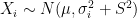 , which came from
  different instruments. Here
  is still a good estimation of
 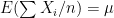 . Now, a more challenging problem is to infer what is the underlying variability of the phenomenon of interest
  . Under our previous setup, the problem is reduced to estimating
  as we are assuming
  ,
,![\sum [(X_i- \mu)^2 - (\sigma_i^2 + S^2)] /(\sigma_i^2 + S^2)^2 = 0](https://s0.wp.com/latex.php?latex=%5Csum+%5B%28X_i-+%5Cmu%29%5E2+-+%28%5Csigma_i%5E2+%2B+S%5E2%29%5D+%2F%28%5Csigma_i%5E2+%2B+S%5E2%29%5E2+%3D+0&bg=ffffff&fg=000&s=0&c=20201002) .
.![E[\sum (X_i-\sum X_i/n)^2] = (1-1/n) \sum \sigma_i^2 + (n-1) S^2](https://s0.wp.com/latex.php?latex=E%5B%5Csum+%28X_i-%5Csum+X_i%2Fn%29%5E2%5D+%3D+%281-1%2Fn%29+%5Csum+%5Csigma_i%5E2+%2B+%28n-1%29+S%5E2&bg=ffffff&fg=000&s=0&c=20201002)
 .
. and where the variance of the phenomenon of interest
  . In the first scenario
 ![[10,1500^2]](https://s0.wp.com/latex.php?latex=%5B10%2C1500%5E2%5D&bg=ffffff&fg=000&s=0&c=20201002) , in the second from
, in the second from ![[10,1500^2 \times 3]](https://s0.wp.com/latex.php?latex=%5B10%2C1500%5E2+%5Ctimes+3%5D&bg=ffffff&fg=000&s=0&c=20201002) and in the third from
and in the third from ![[10,1500^2 \times 5]](https://s0.wp.com/latex.php?latex=%5B10%2C1500%5E2+%5Ctimes+5%5D&bg=ffffff&fg=000&s=0&c=20201002) . In each scenario the value of
. In each scenario the value of  is estimated 1000 times taking each time another 200 realisations of
  First simulation scenario where
  are shown by the blue (maximum likelihood) and red (alternative) histograms.
 First simulation scenario where
  First simulation scenario where

