
 In February I was very fortunate to attend the Biophysical Society 62nd Annual Meeting, which was held in San Francisco – my first real conference and my first trip to North America. Despite arriving with the flu, I had a great time! The conference took place over five days, during which there were manageable 15-minute talks covering a huge range of Biophysics-related topics, and a few thousand more posters on display (including mine). With almost 6,500 attendees, it was also large enough to slip across the road to the excellent SF Museum of Modern Art without anyone noticing.
The best presentation of the conference was, of course, Saulo’s talk on integrating biological folding features into protein structure prediction [1]. Aside from that, here are a few more of my favourites:
Folding proteins from one end to the other
Micayla A. Bowman, Patricia L. Clark [2]
Here in the COFFEE (COtranslational Folding Family of Expert Enthusiasts) office, we love to talk about the vectorial nature of cotranslational folding and how it contributes to the efficiency of protein folding in vivo. Micayla Bowman and Patricia Clark have created a novel technique that will allow the effects of this vectorial folding to be investigated specifically in vitro.

The Clp complex grabs, unfolds and degrades proteins (diagram from [3]). ClpX, the translocase unit of this complex, was used to recapitulate vectorial protein refolding in vitro for the first time.

The YKB construct used to demonstrate the vectorial folding mediated by ClpX (diagram from [4]).
An ambiguous view of protein architecture
Guillaume Postic, Charlotte Perin, Yassine Ghouzam, Jean-Christope Gelly [Poster abstract: 5, Paper: 6]
This work addresses the ambiguity of domain definition by assigning multiple possible domain boundaries to protein structures. Their automated method, SWORD (Swift and Optimised Recognition of Domains), performs protein partitioning via the hierarchical clustering of protein units (PUs) [7], which are smaller than domains and larger than secondary structures. The structure is first decomposed into protein units, which are then merged depending on the resulting “separation criterion” (relative contact probabilities) and “compactness” (contact density).
Their method is able to reproduce the multiple conflicting definitions that often exist between domain databases such as SCOP and CATH. Additionally, they present a number of cases for which the alternative domain definitions have interesting implications, such as highlighting early folding regions or functional subdomains within “single-domain” structures.

Alternative SWORD domain delineations identify (R) an ultrafast folding domain and (S,T) stable autonomous folding regions within proteins designated single-domain by other methods [6]
Dual function of the trigger factor chaperone in nascent protein folding
Kaixian Liu, Kevin Maciuba, Christian M. Kaiser [8]
The authors of this work used optical tweezers to study the cotranslational folding of the first two domains of 5-domain protein elongation factor G.
In agreement with a number of other presentations at the conference, they report that interactions with the ribosome surface during the early stages of translation slows folding by stabilising disordered states, preventing both native and misfolded conformations. They found that the N-terminal domain (G domain) folds independently, while the subsequent folding of the second domain (Domain II) requires the presence of the folded G domain. Furthermore, while partially extruded, unfolded domain II destabilises the native G domain conformation and leads to misfolding. This is prevented in the presence of the chaperone Trigger factor, which protects the G domain from unproductive interactions and unfolding by stabilising the native conformation. This work demonstrates interesting mechanisms by which Trigger factor and the ribosome can influence the cotranslational folding pathway.

Optical tweezers are used to interrogate the folding pathway of a protein during stalled cotranslational folding. Mechanical force applied to the ribosome and the N-terminal of the nascent chain causes unfolding events, which can be identified as sudden increases in the extension of the chain. (Figure from [9])
Predicting protein contact maps directly from primary sequence without the need for homologs
Thrasyvoulos Karydis, Joseph M. Jacobson [10]
The prediction of protein contacts from primary sequence is an enormously powerful tool, particularly for predicting protein structures. A major limitation is that current methods using coevolution inference require a large multiple sequence alignment, which is not possible for targets without many known homologous sequences.
In this talk, Thrasyvoulos Karydis presented CoMET (Convolutional Motif Embeddings Tool), a tool to predict protein contact maps without a multiple sequence alignment or coevolution data. They extract structural and sequence motifs from known sequence-structure pairs, and use a Deep Convolutional Neural Network to associate sequence and structure motif embeddings. The method was trained on 137,000 sequence-structure pairs with a maximum of 256 residues, and is able to recreate contact map patterns with low resolution from primary sequence alone. There is no paper on this yet, but we’ll be looking out for it!
1. de Oliveira, S.H. and Deane, C.M., 2018. Exploring Folding Features in Protein Structure Prediction. Biophysical Journal, 114(3), p.36a.
2. Bowman, M.A. and Clark, P.L., 2018. Folding Proteins From One End to the Other. Biophysical Journal, 114(3), p.200a.
3. Baker, T.A. and Sauer, R.T., 2012. ClpXP, an ATP-powered unfolding and protein-degradation machine. Biochimica et Biophysica Acta (BBA)-Molecular Cell Research, 1823(1), pp.15-28.
Acta (BBA) – Molecular Cell Research, 2012, 1823 (1), 15-28
4. Sander, I.M., Chaney, J.L. and Clark, P.L., 2014. Expanding Anfinsen’s principle: contributions of synonymous codon selection to rational protein design. Journal of the American Chemical Society, 136(3), pp.858-861.
5. Postic, G., Périn, C., Ghouzam, Y. and Gelly, J.C., 2018. An Ambiguous View of Protein Architecture. Biophysical Journal, 114(3), p.46a.
6. Postic, G., Ghouzam, Y., Chebrek, R. and Gelly, J.C., 2017. An ambiguity principle for assigning protein structural domains. Science advances, 3(1), p.e1600552.
7. Gelly, J.C. and de Brevern, A.G., 2010. Protein Peeling 3D: new tools for analyzing protein structures. Bioinformatics, 27(1), pp.132-133.
8. Liu, K., Maciuba, K. and Kaiser, C.M., 2018. Dual Function of the Trigger Factor Chaperone in Nascent Protein Folding. Biophysical Journal, 114(3), p.552a.
9. Liu, K., Rehfus, J.E., Mattson, E. and Kaiser, C., 2017. The ribosome destabilizes native and non‐native structures in a nascent multi‐domain protein. Protein Science.
10. Karydis, T. and Jacobson, J.M., 2018. Predicting Protein Contact Maps Directly from Primary Sequence without the Need for Homologs. Biophysical Journal, 114(3), p.36a.


 , and we perform arithmetic based on this ten digit notation. This doesn’t always matter much for pen and paper maths but it’s an integral part of how we think about more complex operations and in particular how we think about accuracy. We see
  as a finite decimal fraction, and so it’s only natural that we should be able to do accurate sums with it. And if we can do simple arithmetic, then surely computers can too? In this blog post I’m going to try and briefly explain what causes rounding errors such as the one above, and how we might get away with going beyond machine precision.
 , say
, say  . The decimal representation of
  is of the form
 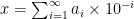 . The
. The 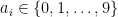 here are the digits that go after the radix point. In the case of
  , or
, or  . Some numbers, such as our favourite
  , do, meaning that after some
  , all
, all  . When we talk about rounding errors and accuracy, what we actually mean is that we only care about the first few digits, say
  , and we’re happy to approximate to
 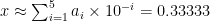 , potentially rounding up at the last digit.
 ,
,  to represent the same number. Our favourite number
  rather than
  , despite the fact it appears as the latter on a computer screen. Crucially, arithmetic is done in base-2 and, since only a finite number of binary digits are stored (
 for most purposes these days), rounding errors also occur in base-2.
 also have a finite decimal expansion, meaning we can do accurate arithmetic with them in both systems. However, the reverse isn’t true, which is what causes the issue with
  . In binary, the nice and tidy
  . We observe the rounding error because unlike us, the computer is trying to sum over infinite series.
 , where
  . In the example above, the issue comes from dividing by 10 on each side of the (in)equality. Luckily for us, we can avoid doing so. Integer arithmetic is easy in any base, and so
 and shifting the division by
  to the right-hand side of each inequality / assignment operator:
 ), implementing the above lets us compute
  with arbitrary precision given by


