Why network comparison?
Many complex systems can be represented as networks, including friendships (e.g. Facebook), the World Wide Web trade relations and biological interactions. For a friendship network, for example, individuals are represented as nodes and an edge between two nodes represents a friendship. The study of networks has thus been a very active area of research in recent years, and, in particular, network comparison has become increasingly relevant. Network comparison, itself, has many wide-ranging applications, for example, comparing protein-protein interaction networks could lead to increased understanding of underlying biological processes. Network comparison can also be used to study the evolution of networks over time and for identifying sudden changes and shocks.

An example of a network.
How do we compare networks?
There are numerous methods that can be used to compare networks, including alignment methods, fitting existing models,
global properties such as density of the network, and comparisons based on local structure. As a very simple example, one could base comparisons on a single summary statistic such as the number of triangles in each network. If there was a significant difference between these counts (relative to the number of nodes in each network) then we would conclude that the networks are different; for example, one may be a social network in which triangles are common – “friends of friends are friends”. However, this a very crude approach and is often not helpful to the problem of determining whether the two networks are similar. Real-world networks can be very large, are often deeply inhomogeneous and have multitude of properties, which makes the problem of network comparison very challenging.
A network comparison methodology: Netdis
Here, we describe a recently introduced network comparison methodology. At the heart of this methodology is a topology-based similarity measure between networks, Netdis [1]. The Netdis statistic assigns a value between 0 and 1 (close to 1 for very good matches between networks and close to 0 for similar networks) and, consequently, allows many networks to be compared simultaneously via their Netdis values.
The method
Let us now describe how the Netdis statistic is obtained and used for comparison of the networks G and H with n and m nodes respectively.
For a network G, pick a node i and obtain its two-step ego-network. That is, the network induced by collection of all nodes in G that are connected to i via a path containing at most two edges. By induced we mean that a edge is present in the two-step ego-network of i if and only if it is also present in the original network G. We then count the number of times that various subgraphs occur in the ego-network, which we denote by  for subgraph w. For computational reasons, this is typically restricted to subgraphs on 5 or fewer nodes. This processes is repeated for all nodes in G, for fixed k=3,4,5.
- Under an appropriately chosen null model, an expected value for the quantities is given, denoted by
 . We omit some of these details here, but the idea is to centre the quantities to remove background noise from an individual networks.
- Under an appropriately chosen null model, an expected value for the quantities is given, denoted by . We omit some of these details here, but the idea is to centre the quantities to remove background noise from an individual networks.
- Calculate:

- To compare networks G and H, define:
 where A(k) is the set of all subgraphs on k nodes and
 is a normalising constant that ensures that the statistic
  takes values between -1 and 1. The corresponding Netdis statistic is:
  which now takes values in the interval between 0 and 1.
- The pairwise Netdis values from the equation above are then used to build a similarity matrix for all query networks. This can be done for any
 , but for computational reasons, this typically needs to be limited to
  . Note that for k=3,4,5 we obtain three different distance matrices.
- The performance of Netdis can be assessed by comparing the nearest neighbour assignments of networks according to Netdis with a ‘ground truth’ or ‘reference’ clustering. A network is said to have a correct nearest neighbour whenever its nearest neighbour according to Netdis is in the same cluster as the network itself. The overall performance of Netdis on a given data set can then be quantified using the nearest neighbour score (NN), which for a given set of networks is defined to be the fraction of networks that are assigned correct nearest neighbours by Netdis.

The phylogenetic tree obtained by Netdis for protein interaction networks. The tree agrees with the currently accepted phylogeny between these species.
Why Netdis?
The Netdis methodology has been shown to be effective at correctly clustering networks from a variety of data sets, including both model networks and real world networks, such Facebook. In particular, the methodology allowed for the correct phylogenetic tree for five species (human, yeast, fly, hpylori and ecoli) to be obtained from a Netdis comparison of their protein-protein interaction networks. Desirable properties of the Netdis methodology are the following:
\item The statistic is based on counts of small subgraphs (for example triangles) in local neighbourhoods of nodes. By taking into account a variety of subgraphs, we capture the topology more effectively than by just considering a single summary statistic (such as number of triangles). Also, by considering local neighbourhoods, rather than global summaries, we can often deal more effectively with inhomogeneous graphs.
- The Netdis statistic contains a centring by subtracting background expectations from a null model. This ensures that the statistic is not dominating by noise from individual networks.
- The statistic also contains a rescaling to ensure that counts of certain commonly represented subgraphs do not dominate the statistic. This also allows for effective comparison even when the networks we are comparing have a different number of nodes.
- The statistic is normalised to take values between 0 and 1 (close to 1 for very good matches between networks and close to 0 for similar networks). The statistic gives values between 0 and 1 and based on this number, we can simultaneously compare many networks; networks with Netdis value close to one can be clustered together. This offers the possibility of network phylogeny reconstruction.
A new variant of Netdis: subsampling

The performance of Netdis under subsampling for a data set consisting of protein interaction networks. The performance of Netdis starts to deteriorate significantly only after less than 10% of ego networks are sampled.
Despite the power of Netdis as an effective network comparison method, like many other network comparison methods, it can become computationally expensive for large networks. In such situations the following variant of Netdis may be preferable (see [2]). This variant works by only querying a small subsample of the nodes in each network. An analogous Netdis statistic is then computed based on subgraph counts in the two-step ego networks of the sampled nodes. From numerous simulation studies and experimentations, it has been shown that this statistic based on subsampling is almost as effective as Netdis provided that at least 5 percent of the nodes in each network are sampled, with the new statistic only really dropping off significantly when fewer than 1 percent of nodes are sampled. Remarkably, this procedure works well for inhomogeneous real-world networks, and not just for networks realised from classical homogeneous random graphs, in which case one would not be surprised that the procedure works.
Other network comparison methods
Finally, we note that Netdis is one of many network comparison methodologies present in the literature Other popular network comparison methodologies include GCD [3], GDDA [4], GHOST [5], MI-Graal [6] and NETAL [7].
[1] Ali W., Rito, T., Reinert, G., Sun, F. and Deane, C. M. Alignment-free protein
interaction network comparison. Bioinformatics 30 (2014), pp. i430–i437.
[2] Ali, W., Wegner, A. E., Gaunt, R. E., Deane, C. M. and Reinert, G. Comparison of
large networks with sub-sampling strategies. Submitted, 2015.
[3] Yaveroglu, O. N., Malod-Dognin, N., Davis, D., Levnajic, Z., Janjic, V., Karapandza,
R., Stojmirovic, A. and Prˇzulj, N. Revealing the hidden language of complex networks. Scientific Reports 4 Article number: 4547, (2014)
[4] Przulj, N. Biological network comparison using graphlet degree distribution. Bioinformatics 23 (2007), pp. e177–e183.
[5] Patro, R. and Kingsford, C. Global network alignment using multiscale spectral
signatures. Bioinformatics 28 (2012), pp. 3105–3114.
[6] Kuchaiev, O. and Przulj, N. Integrative network alignment reveals large regions of
global network similarity in yeast and human. Bioinformatics 27 (2011), pp. 1390–
1396.
[7] Neyshabur, B., Khadem, A., Hashemifar, S. and Arab, S. S. NETAL: a new graph-
based method for global alignment of protein–protein interaction networks. Bioinformatics 27 (2013), pp. 1654–1662.


![\sum [(X_i- \mu)^2 - (\sigma_i^2 + S^2)] /(\sigma_i^2 + S^2)^2 = 0](https://s0.wp.com/latex.php?latex=%5Csum+%5B%28X_i-+%5Cmu%29%5E2+-+%28%5Csigma_i%5E2+%2B+S%5E2%29%5D+%2F%28%5Csigma_i%5E2+%2B+S%5E2%29%5E2+%3D+0&bg=ffffff&fg=000&s=0&c=20201002)
![E[\sum (X_i-\sum X_i/n)^2] = (1-1/n) \sum \sigma_i^2 + (n-1) S^2](https://s0.wp.com/latex.php?latex=E%5B%5Csum+%28X_i-%5Csum+X_i%2Fn%29%5E2%5D+%3D+%281-1%2Fn%29+%5Csum+%5Csigma_i%5E2+%2B+%28n-1%29+S%5E2&bg=ffffff&fg=000&s=0&c=20201002)


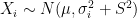
![[10,1500^2]](https://s0.wp.com/latex.php?latex=%5B10%2C1500%5E2%5D&bg=ffffff&fg=000&s=0&c=20201002)
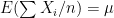
![[10,1500^2 \times 3]](https://s0.wp.com/latex.php?latex=%5B10%2C1500%5E2+%5Ctimes+3%5D&bg=ffffff&fg=000&s=0&c=20201002)
![[10,1500^2 \times 5]](https://s0.wp.com/latex.php?latex=%5B10%2C1500%5E2+%5Ctimes+5%5D&bg=ffffff&fg=000&s=0&c=20201002)

 First simulation scenario where
 First simulation scenario where
  First simulation scenario where


