
Pearson’s R (correlation coefficient) is a measure of the linear correlation between two variables, giving a value between -1 and 1, where 1 is total positive linear correlation, 0 is no linear correlation, and -1 is total negative linear correlation. While it’s a useful statistic for understanding the relationship between two variables, it is often used to compare the performance of two or more models. For example, imagine we had experimental values that we are predicting and several models’ predictions. Obviously, we would prefer the model with the highest Pearson’s R … or perhaps not?
Pearson’s R has some properties that are often overlooked. The most salient reasons are that correlation is both scale and constant invariant:
I can add 7 to all my predicted values and I would get the same correlation. The predictions are way off but the correlation is still high
I can multiply all my predicted values by 7 and I would get the same correlation. The predictions are way off but the correlation is still high.
Correlation can also hide when you are predicting poorly. For example, if we write down the model:

Where \epsilon errors are sampled from the standard normal distribution. Then the correlation between X and Y is high (typically around > 0.98 in a couple of simulations tested by hand). However, this masks the fact that errors grow and shrink according to the period of sin(X).
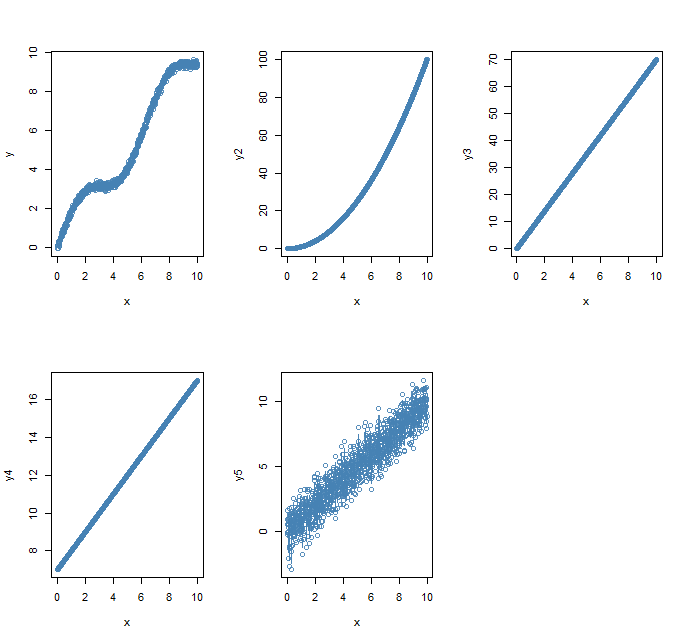
To see what could go wrong, I simulated 5 scenarios, assuming that X are the true underlying values (numbers from 0 to 10 at 0.1 increments) and what we predicted ended up being Y:

For a particular random sample of errors I got the following correlations:
- 0.973
- 0.968
- 1
- 1
- 0.941
The results seem particularly odd if we look at the plots, yes 3 and 4) have great correlation but the predicted values are way off.
Correlations are also sensitive to outliers so we may also be fooled by a few values being off when in general it’s a good predictor.
So what are the alternatives? There are many with different benefits/compromises:
- Mean squared error (MSE)
- Simple
- Not on the same scale as data
- Sensitive to outlier
- Mean absolute deviation (Mean AD)
- On the same scale as data
- Less sensitive to outliers
- Linear sensitivity of errors
- Median absolute deviation (MAD)
- More robust to outliers
- Robust to skewness of distributions
For each of the scenarios, I computed each of these metrics:
| MSE | Mean AD | MAD | |
| Scenario 1 | 0.48 | 0.62 | 0.66 |
| Scenario 2 | 1535.85 | 28.38 | 20 |
| Scenario 3 | 1200.6 | 30 | 30 |
| Scenario 4 | 49 | 7 | 7 |
| Scenario 5 | 1.04 | 0.82 | 0.72 |
Clearly, Scenario 1 is preferred: despite the nonlinearity, the low variance leads to better predictions on average. Note that if Scenario 5 had slightly smaller variance then it would be the preferred model.
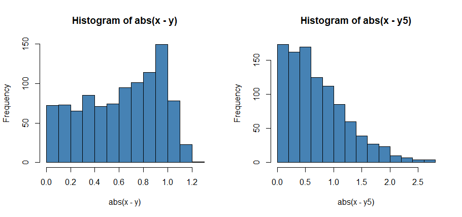
Further visualization and considerations. Perhaps we don’t care about the performance on average and we only care about the predictions that are a certain distance from the truth. For example, let’s consider that we make a bet and win money only if our predictions are within 0.1 of the truth. Focusing in on Scenario 1 and Scenario 5, Scenario 5 would actually be better as about 10% of the predictions are within 0.1, whilst for Scenario 1 about 7% of the predictions are within 0.1
To visualize this you can look at histograms of errors: for Scenarios 1 and 5, we can see that deviations for Scenario 5 are concentrated around 0 but have a long tail which is causing the higher values of MSE.
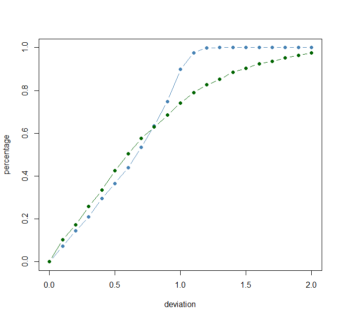
We can also view the cumulative percentage of errors at each distance away from the predicted true value, we can see that there are actually more predictions within 0.7 in scenario 5 but because of the long tail there are a large chunk of more extreme predictions.
So which model would we prefer? The unhelpful answer is that it depends. The answer depends on what you want your model to do: so instead of jumping straight to your usual metric, you should spend some time indicating what you want your predictions to look like and justify those for the scientific problem at hand. If it don’t just present all the metric and some graphical representations and let others decide what’s important to them.
Does this have implications for loss functions? Yes! You can encourage your model to have a specific behavior if you choose to optimize one of these metrics as a loss/score function instead.