How many bins?

As it’s known in non-parametric kernel density estimation the effect of the bandwidth on the estimated density is large and it is usually the parameter who makes the tradeoff between bias and roughness of the estimation (Jones et.al 1996). An analogous problem for histograms is the choice of the bin length and in cases of equal bin lengths the problem can be seen as finding the number of bins to use.  A data-base methodology for building equal bin-length histograms proposed by (Knuth 2013) based on the marginal of the joint posterior of the number of bins and heights of the bins. To build the histogram first the number of bins has to be selected as the the value (\hat{M} ) that maximises the following posterior distribution for the number of bins:
P(M|d,I)\, \alpha \,(M/V)^N \frac{\Gamma(M/2) \prod_{k=1}^M \Gamma(n_k+1/2)}{\Gamma(1/2)^M \Gamma(N+M/2)}

where M is the number of bins, d is the data, I is prior knowledge about the problem, i.e. in particular the use of equal length bins and the range of data V, which has the relation V=Mw where w is the width of bins, N is the number of data points and n_k is the number of observations that fall in the kth bin.

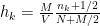
Now, the height (h_k) of the bins of the histogram is given by:
h_k=\frac{M}{V} \frac{n_k+1/2}{N+M/2}.

In the case of a normal distribution the authors suggest a sample of 150 data points to “accurately and consistently estimate the shape of the distribution”.

The following figure shows the relative log-posterior of the number of bins (left) and the estimated histogram for a mixture of three normal samples and a uniform [0,50] (right).

Optimal binning

Knuth, K. H. (2013). Optimal data-based binning for histograms. arXiv preprint physics/0605197. The first version of this paper was published on 2006.

Jones, M. C., Marron, J. S., and Sheather, S. J. (1996). A brief survey of bandwidth selection for density estimation. Journal of the American Statistical Association,91(433), 401–407.

Annotate Antibody CDR and Framework Residues

Intro

Antibodies have very well conserved structures and their binding site is chiefly comprised of the six CDRs. The great similarity between the 1700+ antibody structures that can be found in SAbDab/PDB prompted the introduction of numbering schemes which act as coordinates with respect to the sequence/structural features of antibodies. The earliest such numbering scheme was introduced by Wu and Kabat, followed by the structurally informed Chothia-scheme which was eventually amended by Abhinandan and Martin. Even though there are several of those schemes, the one currently endorsed by the World Health Organization (WHO) is this of IMGT.

The Program Downolad.

It annotates the framework and CDR residues according to three definitions: Kabat, Chothia or Contact. You can download it here.

Possible issues?

You need internet connection for this program to work since it calls the Abnum service, thus you should cite the following if you use this code:

Abhinandan, K.R. and Martin, A.C.R. (2008) Analysis and improvements to Kabat and structurally correct numbering of antibody variable domains Molecular Immunology, 45, 3832-3839.

How to use it?

As an example test case, type the following in the Framer directory:

python Framer.py --f 1A2Y.pdb --c AB --o my_first_output --d chothia

This should get the the heavy and light chains of 1A2Y (A and B) and leave the output in a folder called my_first_outupt.

Options:

–f: Antibody file
–c: Antibody chains (you can submit just one or several)
–o: Output folder name – NB this is going to be created in the directory you call Framer from!
–d: CDR definition to be used, possible options are: chothia, kabat and contact.

Output files:

There are four output files:

red_blue.pdb: The pdb with b-factor colored CDRs. The CDRs have B-factor of 100.00 and the framework 0.00.
paratope.txt: The CDR residues, given in the format [id][whitespace][chain]
framework.txt: The Framework residues, given in the format [id][whitespace][chain]
full_info.txt: Full breakdown of the annotation given in the format:

Original ID Original Chain AA Chothia ID CDR(FR=frame,or CDR id)


Journal club: Half a century of Ramachandran plots

In last week’s journal club we delved into the history of Ramachandran plots (Half a century of Ramachandran plots; Carugo & Djinovic-Carugo, 2013).

Polypeptide backbone dihedral angles

Polypeptide backbone dihedral angles. Source: Wikimedia Commons, Bensaccount

50 years ago Gopalasamudram Narayana Ramachandran et al. predicted the theoretically possible conformations of a polypeptide backbone. The backbone confirmations can be described using three dihedral angles: ω, φ and ψ (shown to the right).

The first angle, ω, is restrained to either about 0° (cis) or about 180° (trans) due to the partial double bond character of the C-N bond. The φ and ψ angles are more interesting, and the Ramachandran plot of a protein is obtained by plotting φ/ψ angles of all residues in a scatter plot.

The original Ramachandran plot showed the allowed conformations of the model compound N-acetyl-L-alanine-methylamide using a hard-sphere atomic model to keep calculations simple. By using two different van der Waals radii for each element positions on the Ramachandran plot could be classified into either allowed regions, regions with moderate clashes and disallowed regions (see Figure 3 (a) in the paper).

The model compound does not take side chains into account, but it does assume that there is a side chain. The resulting Ramachandran plot therefore does not describe the possible φ/ψ angles for Glycine residues, where many more conformations are plausible. On the other end of the spectrum are Proline residues. These have a much more restricted range of possible φ/ψ angles. The φ/ψ distributions of GLY and PRO residues are therefore best described in their own Ramachandran plots (Figure 4 in the paper).

Over time the Ramachandran plot was improved in a number of ways. Instead of relying on theoretical calculations using a model compound, we can now rely on experimental observations by using high quality, hand picked data from the PDB. The way how the Ramachandran plot is calculated has also changed: It can now be seen as a two-dimensional, continuous probability distribution, and can be estimated using a full range of smoothing functions, kernel functions, Fourier series and other models.
The modern Ramachandran plot is much more resolved than the original plot. We now distinguish between a number of well-defined, different regions which correlate with secondary protein structure motifs.

Ramachandran plots are routinely used for structure validation. The inherent circular argument (A good structure does not violate the Ramachandran plot; The plot is obtained by looking at the dihedral angles of good structures) sounds more daring than it actually is. The plot has changed over time, so it is not as self-reinforcing as one might fear. The Ramachandran plot is also not the ultimate guideline. If a new structure is found that claims to violate the Ramachandran plot (which is based on a huge body of cumulative evidence), then this claim needs to be backed up by very good evidence. A low number of violations of the plot can usually be justified. The Ramachandran plot is a local measure. It therefore does not take into account that domains of a protein can exert a force on a few residues and just ‘crunch’ it into an unusual conformation.

The paper closes with a discussion of possible future applications and extensions, such as the distribution of a protein average φ/ψ and an appreciation of modern web-based software and databases that make use of or provide insightful analyses of Ramachandran plots.

Link

Journal club (Bernhard Knapp): NetMHCIIpan-3.0

This week’s topic of the Journalclub was about the prediction of potential T cell epitopes (=prediction of the binding affinity between peptides and MHC). In this context I presented the latest paper in the NetMHCpan series:

Karosiene E, Rasmussen M, Blicher T, Lund O, Buus S, Nielsen M. NetMHCIIpan-3.0, a common pan-specific MHC class II prediction method including all three human MHC class II isotypes, HLA-DR, HLA-DP and HLA-DQ. Immunogenetics. 2013 Oct;65(10):711-24

The reliable prediction of the peptide/MHC binding affinity is already a scientific aim for several years: Early approaches were based on the concept of anchor residues i.e. those peptide side-chain which are pointing in the direction of the MHC. The next “generation” of methods was matrix based i.e. it was simply counted how likely it is that a specific residue is at peptide position 1, 2, 3, … for binding and non-binding peptides of a specific MHC allele. In the next step methods started to incorporate higher order approaches i.e. positions within the peptide influence each other (e.g. SVM, ANN, …). While such methods are already quite reliable their major limitation is that they can only be trained on the basis of sufficient experimental binding data per allele. Therefore a prediction for alleles with only few experimental peptide binding affinities is not possible or rather poor in quality. This is especially import because there are several thousand HLA alleles: The latest version of the IPD – IMGT/HLA lists for example 1740 HLA Class I A and 2329 HLA Class I B proteins (http://www.ebi.ac.uk/ipd/imgt/hla/stats.html). Some of them are very frequent and others are not but this the aim would be a 100% coverage.

Pan specific approaches go one step further and allow the binding prediction between peptide and an arbitrary MHC allele for which the sequence is known. The NetMHCpan approach is one of them and is based on the extraction of a pseudo sequence (those MHC residues which are in close proximity to the peptide) per MHC allele. Subsequently this MHC pseudo sequence as well as the peptide sequences are encoded using some algorithm e.g. a BLOSUM matrix. Finally the encoded sequences and the experimental binding affinities are fed into an Artificial Neural Network (ANN). For an illustration of the workflow see:

NetMHCpan workflow
http://www.ncbi.nlm.nih.gov/pmc/articles/PMC2981877/bin/1745-7580-6-S2-S3-2.jpg

This approach turned out to be quite successful and (not too much) depending on the allele the area under ROC reaches in average a healthy 0.8x number which is already quite competitive with experimental approaches.

The netMHCpan series has progressed over the last years starting to cover MHC class I in humans (2007) and beyond (2009). Then MHC class II DR (2010) and in the latest version also DP and DQ (2013). With the next paper expected to be about non human MHC class II alleles the prediction of the binding affinity between peptides and pretty much every MHC should be possible.

AH^AH – Alpha Helices Assessed by Humans.

Can you help our research, by sparing about 15 minutes of your time to participate in our crowd-sourcing experiment? Click here!

We have created a game-like web-application to classify protein helices. If you participate it will take you about 15 minutes and afterwards we will show you the relation between your results and all other participants. You do not need any specific training to participate – your natural human puzzle solving skills are sufficient. Try to beat the others!

blog3

We are interested in kinked α-helices in proteins. Kinks are important for protein function, and understanding them will help to treat and design therapies for diseases. One hindrance to our work is that helix kinks are not well defined – there are many helices that are classed as kinked by some scientists, but not by others. Classifying helices as kinked or curved or straight is difficult computationally. There are lots of different way to do it, but they all give different answers. We think that humans can do it better.

Can you help us by sparing about 15 minutes of your time to assess some α-helices? Click here!

Edit: To participate in this, you need to register. While the data will be made anonymous, registration is required for a number of reasons. It allows you to log back in, and view you results at a later date, it gives us a record that you have participated (so that we can acknowledge your help), and it allows us to compare the results from people with different educational backgrounds. There are also some legal reasons, and it is much more simple if we can record that you have agreed to the privacy and cookies policy, and do not have to ask permission every time you return. We will not pass your data on to third parties, and the data is stored securely (and the passwords encrypted).

Wilcoxon-Mann-Whitney test and a small sample size

The Wilcoxon Mann Whitney test (two samples), is a non-parametric test used to compare if the distributions of two populations are shifted , i.e. say f_1(x) =f_2(x+k) where k is the shift between the two distributions, thus if k=0 then the two populations are actually the same one. This test is based in the rank of the observations of the two samples, which means that it won’t take into account how big the differences between the values of the two samples are, e.g. if performing a WMW test comparing S1=(1,2) and S2=(100,300) it wouldn’t differ of comparing S1=(1,2) and S2=(4,5). Therefore when having a small sample size this is a great loss of information.

Now, what happens when you perform a WMW test on samples of size 2 and 2 and they are as different as they can be (to what the test concerns), lest say S1=(1,2) and S2=(4,5). Then the p-value of this test would be 0.333, which means that the smallest p-value you can obtain from a WMW test when comparing two samples of size 2 and 2 is 0.3333. Hence you would only be able to detect differences between the two samples when using a level of significance greater than 0.333 .

Finally you must understand that having a sample of two is usually not enough for a statistical test. The following table shows the smallest  p-value for different small sample sizes when the alternative hypothesis is two sided. (Values in the table are rounded).

Screen Shot 2015-01-20 at 10.50.56

CABS-flex

One of the still open questions in bioinformatics is that of the flexibility of proteins, and it is one in which I am quite interested. Our main source of structural information is X-ray diffraction experiments, in which the crystalline protein is intrinsically rigid. While there is an ever increasing body of NMR data, and Molecular Dynamics simulations are becoming faster and cheaper, complete information about the dynamics of every PDB structure is a long way off. All atom MD simulations for a complete protein still take either days, or a powerful computer. So, naturally, any papers that talk about ways to get flexibility information catch my attention.

The paper that caught my attention was CABS-flex: Server for fast simulation of protein structure fluctuations.. There also is a connected paper – Consistent View of Protein Fluctuations from All-Atom Molecular Dynamics and Coarse-Grained Dynamics with Knowledge-Based Force-Field – which benchmarks their method against MD simulations.

The CABS model pops up in a number of other places – there is a CABS-fold server, and the method was first described in the paper Consistent View of Protein Fluctuations from All-Atom Molecular Dynamics and Coarse-Grained Dynamics with Knowledge-Based Force-Field from 2004.

What does the webserver do?

You give it a coordinate file, wait some hours, and it gives you back a series of (clustered) structures, a C&alpha trajectory, a residue flexibility profile, and a nice little video. Which is nice. It is, however, a little limited; you can only do a single chain (so no modelling of small molecule or peptide interactions), there is no way of fixing part of the model so it does not flex, and it can be picky about your PDB files – no chain gaps, no strange amino acids. You can tell it to analyse a PDB chain by just entering the code, but these are frequently rejected for having unacceptable coordinate files.

How does it work?

The CABS model makes a reduced representation of the protein, and explores its conformational space by making moves – which are accepted or rejected based on a (comparatively complex) force field. Many moves are attempted, and over a large number of iterations, this builds up an ensemble of structures, which show the possible confirmations of the protein. So, its a bit like MD, but rather than moving atoms based on calculated forces, you make random moves, and accept the sensible ones.

hello

The model is shown above. The protein structure is reduced to 4 atoms per residue. There are 5 types of move, and in each step, a random move of each type is tried ~n times (n being the number of amino acids in the protein). These are accepted or rejected based on their force field, and the process is repeated several hundred times. The force field used to accept/reject moves is quite complex – there are short range (sequence dependent and sequence independent), hydrogen bond, and long range (again, sequence dependent and sequence independent) interactions. There are sub-categories within these, and the relative contributions of the interactions can be changed. There is no solvent, so the long range interactions have to provide the forces to keep the protein together, and the hydrogen bond interactions act to maintain the secondary structure elements. More detail can be found in the 2004 paper.

Is it true?

The authors justify the method by comparing it to MD simulations taken from a database, and conclude that CABS-flex gives answers as similar to MD simulations as MD simulations using different force fields are to each other. Simply put, the same residues move in their simulations as move in MD simulations. They move more, which backs up their claim that they demonstrate flexibility over a longer time-frame than MD simulations. They do admit that they get the best agreement when they heavily restrict their secondary structure – raising the question of how much of the agreement between all of the methods is down to all the simulations having the same secondary structure.

To conclude, this could be a useful method, particularly in that it can give long time-frame flexibility – providing you treat it as any other measure of flexibility, with a pinch of salt. It is a bit of a shame that the interface is (perhaps frustratingly) simple, and you need to pre-process your coordinate files, as many PDB coordinate files will not be accepted.

A Colourblind Guide to Colourful Presentations…

Like many people, I am colourblind.

Fortunately I am only ‘mildly’ red-green colourblind and it doesn’t have a huge detrimental effect on my life.

Firstly, to dispel a couple of misconceptions:

  1. I can still see colour. ‘blindness’ here would be better called ‘deficiency’ or ‘desensitivity’. I am simply less sensitive to reds/greens than the ‘normal’ eye. Whilst I can discriminate between blues/yellows, it is harder to distinguish some reds from some greens.
  2. Colour blindness is not the swapping of colours. I don’t accidentally call red and green the wrong things – I just can’t tell what a colour is in some cases.
  3. I have no problem with traffic lights.
  4. Colour blindness does not mean poor eyesight. My cornea, lens, etc work fine, thank-you-very-much.

Approximately 8% of men and 0.5% of women are colourblind to various extents. There is a wide range of types, and severities, of colourblindness. For more information, there are a number of websites with helpful descriptions – This, for example…

There’s even a nature paper about colour blindness awareness…

The standard tests for colour-blindness are the well-recognised Ishihara colour tests. Lets do a few (just for fun)…

Ishihara1

An example Ishihara Colour Test. Most people can see the ’12’ in the image. Image: Wikipedia

Ishihara11

Another Colour Test. You might be able to see a ‘6’ in the image (I can’t…). Image: Wikipedia

Ishihara19

Another Colour Test. You should see nothing in this image. I see a ‘2’. Image: Wikipedia

Ishihara23

The last one. You should see a ’42’. I can just about see a nondescript blur that might be a ‘4’ on the left hand side. Image: Wikipedia

To give an idea of what it’s like, this page gives a very good example. For a theatre booking system, they indicate the seats that offer a restricted view of the stage –

Restricted view seats are marked in orange - or are they?

Restricted view seats are clearly indicated – or are they? Image: www.digitalartsonline.co.uk

Whilst most people will be able to tell where the best seats are, for those with colour blindness it might not be so easy. The image below shows the same image from the point of view of someone with colour blindness – can you still be sure of which seat is which?

Still clear?

Still clear? Image: www.digitalartsonline.co.uk

Mostly, being colourblind doesn’t affect my life (when I’m not at the theatre). However, there is one area of my life where being colourblind is *really* annoying: presentations (and picking ties to match shirts, but I’ve got that figured out now).

So here’s the Nick-approved guide to making colour-blind friendly presentations.

  1. Choose a colour scheme that is colour-blind friendly – these are readily available online. This is mainly for graphs. Just generally avoid pale green-pale red mixtures. Purples and pinks can also be pretty confusing.
  2. Along with the above, high contrast colour schemes can be very hard to see. For instance, a presentation with a white background can make it difficult to see coloured things on the slide, as everything is drowned out by the white background – especially yellow/green text. It is also very tiring to the eye. Try dark-coloured fonts on a light-coloured background.
  3. In graphs, don’t just use colours to match lines to the legend – matching colours from lines to the colours on the legend is hard – use shapes as well, or label the lines. An example.
  4. If 3. is impossible, make the lines on graphs a decent thickness – small areas of colour are harder to determine.
  5. When referring to slide, try not to refer to ‘the red box’. Refer instead to ‘the rounded red box in the top-right of the screen’.
  6. Please don’t use red laser pointers – these are evil [citation needed]. The red light is not easily distinguishable on bright screens (or if it’s zipping around the screen). Use a green laser pointer instead. Not only are green laser pointers generally more powerful, and therefore brighter, but they are also easier to see. Why?

For a fairly comprehensive guide of how to make colour-friendly presentations, look at this page. And for checking how things might look, there are many colour-blind simulators for both images and webpages.

I hope this helps to create colour-friendly presentations.

From Protein Interface Recognition to Protein Complex Prediction

Similarly to ‘words’, which need to be “assembled into sentences, paragraphs, chapters and books” to tell a story, ‘protein structures’ need to be assembled into protein complexes to perform a specific task. To form complexes, proteins interact with other proteins, DNA, RNA and small molecules using their interface residues. All those types of interactions are under intense scrutiny by the research community, each of them defining a distinct field of research. During my PhD I focused on protein-protein interactions (PPIs) and prediction of their interfaces. Modifications in PPIs affect the events that take place within cells which may lead to critical diseases such as cancer. Therefore, knowledge about PPIs and their resulting 3D complexes can provide key information for drug design.

Docking is a popular computational method which predicts the possible structure of the complex produced by two proteins using the known 3D structure of the individual proteins. However, docking of two proteins can result in a large number of different conformational models whose majority is far from correct. This highlights one of the main limitations of docking.  Therefore, scoring functions have been proposed which are used to re-score and re-rank docked conformations in order to detect near-native models. One way to distinguish native-like models from false docked poses is to use knowledge of protein interfaces. If one knows the possible location of interface residues on each individual protein, docked complexes which do not involve those interfaces can be rejected. Therefore, accurate prediction of protein interfaces can assist with detection of native-like conformations.

Various methods have been proposed for predicting protein interfaces as mentioned above. A high number of methods investigate protein sequential or structural features in order to characterise protein interfaces. Usage of 3D structural properties has improved the sequence-based predictions.  Moreover, evolutionary conservation was shown to be an important property. Therefore, methods have integrated various structural features along with evolutionary information to increase performance.

The combination of different features using various techniques has been investigated by intrinsic-based predictors. However, it seems that these methods have reached their saturation, and combination of more properties does not improve their prediction performance. On the other hand, many studies have investigated the 3D structure of binding sites among protein families. They discovered that the binding site localisation and structure are conserved among homologous. These properties have improved the detection of functional residues and protein-ligand binding sites. Therefore, predictors took advantage of structurally conserved residues among homologous proteins to improve binding site predictions.

Although homologous template-based predictors improve the predictions, they are limited to those proteins whose homologous structure exists. Therefore, methods have extended their search for templates to structural neighbours, since interface conservation exists even among remote structural neighbours. In addition, with the increase in experimentally determined 3D complexes good quality templates can be found for many proteins. Therefore, usage of structural neighbours is the current focus of template-based protein interfaces predictors.

Although, template-based methods are currently the predictors under the main focus, one of their main limitations is their dependency to availability of the QP 3D structure. Also, these predictors have not investigated the contribution of interacting partners of structural neighbours in the prediction. In addition, since these methods perform structural comparisons their computational time is high which limits their application to high-throughput predictions.

One of my PhD contributions was toward developing, T-PIP (Template based Protein Interface Prediction), a novel PIP approach based on homologous structural neighbours’ information. T-PIP addresses the above mentioned limitations by quantifying, first, homology between QP and its structural neighbours and, second, the diversity between the ligands of the structural neighbours (here, ligands refers to the interacting partners of proteins). Finally, predictions can be performed for sequences of unknown structure if that of a homologous protein is available. T-PIP’s main contribution is the weighted score assigned to each residue of QP, which takes into account not only the degree of similarity between structural neighbours, but also the nature of their interacting partners.

In addition, we used T-PIP prediction to re-rank docking conformations which resulted in T-PioDock (Template based Protein Interface prediction and protein interface Overlap for Docking model scoring), a complete framework for prediction of a complex 3D structure. T-PioDock supports the identification of near-native conformations from 3D models that docking software produced by scoring those models using binding interfaces predicted by T-PIP.

T-PioDock Pipeline

T-PioDock Pipeline

Exhaustive evaluation of interface predictors on standard benchmark datasets has confirmed the superiority of template base approaches and has showed that the T-PIP methodology performs best. Moreover, comparison between T-PioDock and other state-of-the-art scoring methods has revealed that the proposed approach outperforms all its competitors.

Accurate identification of near-native conformations remains a challenging task. Although availability of 3D complexes will benefit to template based methods such as T-PioDock, we have identified specific limitations which need to be addressed. First, docking software are still not able to produce native like models for every target. Second, current interface predictors do not explicitly refer to pair-wise residue interactions which leaves ambiguity when assessing quality of complex conformations.

Life in Colour – Vim

Among programmers, there are occasional debates on what editor is best — some love Eclipse, some are die-hard Emacs supporters, or some have no preference, and use the default text editor(s) with their OS. Whatever your choice, you can never underestimate how useful Vim can be, e.g. if you SSH into another machine. And so, here is a vim config that I’ve been using (thanks to Ben Frot), which makes your vim environment very colourful and easy to read. Code available here.

Plus, you can do awesome things in vim:

Edit multiple files in Vim. Can get a little crazy but, hey, why not?

Edit multiple files in Vim. Can get a little crazy but, hey, why not?

So, to do some of the crazier things (e.g. what I’ve shown in this blog post), try this:

# Open a file of choice
:e blah1.md

# First split to two screens; change between screens by Ctrl + ww
:split 

# Now open a second file
:e blah2.md

# Repeat for more screens & lines.

Happy vim-ing!