Author Archives: Luis Ospina Forero

Plotting and storing a 3D network in R

A simple toy example of a three layered network:

Note 1: In order to view the 3D plots, mac users will need Xquartz  installed (https://www.xquartz.org/).

 
require(igraph)
require(rgl)
#Another package that might be needed is "rglwidget". The function writeWebGL will show an error stating if rglwidget is required.
######################################//// 
######The basics######################////
######################################////
#1) Create a "food" network (three layers) 
set.seed(432)
g1<-watts.strogatz.game(dim = 1,size = 5,nei = 2,p = .5,loops = FALSE,multiple = FALSE)
g2<-watts.strogatz.game(dim = 1,size = 10,nei = 2,p = .2,loops = FALSE,multiple = FALSE)
g3<-watts.strogatz.game(dim = 1,size = 30,nei = 1,p = .5,loops = FALSE,multiple = FALSE)
g123=g1+g2+g3 


#Create more edges btw layers 
g123=rewire(g123,each_edge(prob=.4,loops = FALSE,multiple = FALSE)) 
ne=15;add_edges(g123,edges = cbind(sample(1:vcount(g1),size = ne,replace = TRUE), sample((vcount(g1)+1):vcount(g123),size = ne,replace = TRUE)))#top layer 
ne=30;add_edges(g123,edges = cbind(sample((vcount(g1)+1):(vcount(g1)+vcount(g2)),size = ne,replace = TRUE), sample((vcount(g1)+vcount(g2)+1):vcount(g123),size = ne,replace = TRUE)))#second layer 

#A quick plot of the graph
plot(g123,vertex.size=1,vertex.label.cex=0.02)


#Create 3d coordinates of the network layout
circpos=function(n,r=1){#Coordinates on a circle
 rad=seq(0,2*pi,length.out=n+1)[-1];x=cos(rad)*r;y=sin(rad)*r
 return(cbind(x,y))
}
#
lay=rbind(cbind(circpos(vcount(g1),r=1), runif(n = vcount(g1),-1,1)),
 cbind(circpos(vcount(g2),r=2), runif(n = vcount(g2),6,7)),
 cbind(circpos(vcount(g3),r=4), runif(n = vcount(g3),13,17))
)


#2d plot using the previous layout
plot(g123,vertex.size=5,vertex.label=NA,layout=lay[,c(1,3)])
plot(g123,vertex.size=1,vertex.label=NA,layout=lay[,c(1,2)])

layers

 
#3D graph plot
#Add some colour to nodes and edges
nodecols=c(rep("red",vcount(g1)),
 rep("blue",vcount(g2)),
 rep("yellow",vcount(g3)))

edgecols=function(elist,cols,grouplist){
 whatcol=rep(length(cols)+1,nrow(elist))
 finalcol=whatcol
 for(i in 1:nrow(elist)){
 for(k in length(cols):1){ 
 if( k * (length( intersect(elist[i,], grouplist[[k]]) ) > 0)){
 whatcol[i]=min(whatcol[i], k )
 }
 }
 finalcol[i]=cols[whatcol[i]]
 }
 return(finalcol)
}

#Open 3d viewer
rgl.open()
rglplot(g123, layout=lay,vertex.size=5,vertex.label=NA,vertex.color=nodecols,
 edge.color=edgecols(elist=get.edgelist(g123,names = FALSE),cols=c("orange","green","pink"),grouplist=list(1:vcount(g1), (vcount(g1)+1):(vcount(g1)+vcount(g2)), (vcount(g1)+vcount(g2)+1):vcount(g123)) )
)

3d_layers

###Storing the plot in an html file###

dirfolder="..." #your dir
#rgl.open()#instead of rgl.open use open3d, in order to save the plot. 
open3d()
rglplot(g123, layout=lay,vertex.size=5,vertex.label=NA,vertex.color=nodecols,
 edge.color=edgecols(elist=get.edgelist(g123,names = FALSE),cols=c("orange","green","pink"),grouplist=list(1:vcount(g1), (vcount(g1)+1):(vcount(g1)+vcount(g2)), (vcount(g1)+vcount(g2)+1):vcount(g123)) )
)
#Fix the view
rgl.viewpoint(theta=90, phi=0)

#Save a static 2d image:
rgl.snapshot(paste(dirfolder,"a_png_pic_0.png",sep=""), fmt="png", top=TRUE)

#Save the plot in a .htlm file:
rglfolder=writeWebGL(dir = paste(dirfolder,"first_net3d",sep=""), width=700)

#The previous function should create a file called index.htlm inside the folder "first_net3d". By opening this file in a browser (with javascript enabled) the 3d plot will be displayed again.
#Also the following command will open the plot in the browser:
browseURL(rglfolder)

Note 2: In order to view the .htlm file javascript should be enabled in the browser. (Here is an example on how to do this for safari ).

Although not covered in the previous script, further options are available such as edge/vertex size and the ability to control independently each of the nodes and edges in the graph. Here is an example that makes more use of these options:

clour_plot

3d network representing a T cell receptor. Edges are coloured according to a relevant path found between the bottom green node and the upper red node cluster.

T cell receptor (in blue), binding to a peptide (in red).

T cell receptor (in blue), binding to a peptide (in red).

Quantifying dispersion under varying instrument precision

Experimental errors are common at the moment of generating new data. Often this type of errors are simply due to the inability of the instrument to make precise measurements. In addition, different instruments can have different levels of precision, even-thought they are used to perform the same measurement. Take for example two balances and an object with a mass of 1kg. The first balance, when measuring this object different times might record values of 1.0083 and 1.0091, and the second balance might give values of 1.1074 and 0.9828. In this case the first balance has a higher precision as the difference between its measurements is smaller than the difference between the measurements of balance two.

In order to have some control over this error introduced by the level of precision of the different instruments, they are labelled with a measure of their precision 1/\sigma_i^2 or equivalently with their dispersion \sigma_i^2 .

Let’s assume that the type of information these instruments record is of the form X_i=C + \sigma_i Z,  where Z \sim N(0,1) is an error term, X_i its the value recorded by instrument i and where C is the fixed true quantity of interest the instrument  is trying to measure. But, what if C is not a fixed quantity? or what if the underlying phenomenon that is being measured is also stochastic like the measurement X_i. For example if we are measuring the weight of cattle at different times, or the length of a bacterial cell, or concentration of a given drug in an organism, in addition to the error that arises from the instruments; there is also some noise introduced by dynamical changes of the object that is being measured. In this scenario, the phenomenon of interest, can be given  by a random variable Y \sim N(\mu,S^2). Therefore the instruments would record quantities of the form X_i=Y + \sigma_i Z.

Under this case, estimating the value of \mu, the expected state of the phenomenon of interest is not a big challenge. Assume that there are x_1,x_2,...,x_n values observed from realisations of the variables
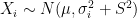
 X_i \sim N(\mu, \sigma_i^2 + S^2), which came from n different instruments. Here \sum x_i /n is still a good estimation of \mu as E(\sum X_i /n)=\mu
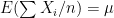
.  Now, a more challenging problem is to infer what is the underlying variability of the phenomenon of interest Y. Under our previous setup, the problem is reduced to estimating S^2 as we are assuming Y \sim N(\mu,S^2) and that the instruments record values of the from X_i=Y + \sigma_i Z.

To estimate S^2 a standard maximum likelihood approach could be used, by considering the likelihood function:

f(x_1,x_2,..,x_n)= \prod  e^{-1/2 \times (x_i-\mu)^2 /(\sigma_i^2+S^2)} \times 1/\sqrt{2 \pi (\sigma_i^2+S^2) },

from which the maximum likelihood estimator of S^2 is given by the solution to

\sum [(X_i- \mu)^2 - (\sigma_i^2 + S^2)] /(\sigma_i^2 + S^2)^2 = 0.

Another more naive approach could use the following result

E[\sum (X_i-\sum X_i/n)^2] = (1-1/n) \sum \sigma_i^2 + (n-1) S^2

from which \hat{S^2}= (\sum (X_i-\sum X_i/n)^2 - ( (1-1/n )  \sum(\sigma_i^2) ) ) / (n-1).

Here are three simulation scenarios where 200 X_i values are taken from instruments of varying precision or variance \sigma_i^2, i=1,2,...,200 and where the variance of the phenomenon of interest S^2=1500. In the first scenario \sigma_i^2 are drawn from [10,1500^2], in the second from [10,1500^2 \times 3] and in the third from [10,1500^2 \times 5]. In each scenario the value of S_2 is estimated 1000 times taking each time another 200 realisations of X_i. The values estimated via the maximum likelihood approach are plotted in blue, and the values obtained by the alternative method are plotted in red. The true value of the S^2 is given by the red dashed line across all plots.

disp1 First simulation scenario where \sigma_i^2, i=1,2,...,200 in [10,1500^2]. The values of  \sigma_i^2 plotted in the histogram to the right. The 1000 estimations of S are shown by the blue (maximum likelihood) and red (alternative) histograms.

disp2 First simulation scenario where \sigma_i^2, i=1,2,...,200 in [10,1500^2 \times 3]. The values of \sigma_i^2 plotted in the histogram to the right. The 1000 estimations of S are shown by the blue (maximum likelihood) and red (alternative) histograms.

First simulation scenario where \sigma_i^2, i=1,2,...,200 in [10,1500^2 \times 5]. The values of \sigma_i^2 plotted in the histogram to the right. The 1000 estimations of S are shown by the blue (maximum likelihood) and red (alternative) histograms.

For recent advances in methods that deal with this kind of problems, you can look at:

Delaigle, A. and Hall, P. (2016), Methodology for non-parametric deconvolution when the error distribution is unknown. Journal of the Royal Statistical Society: Series B (Statistical Methodology), 78: 231–252. doi: 10.1111/rssb.12109

Network Hubs

Some times real networks contain few nodes that are connected to a large portion of the nodes in the network. These nodes, often called ‘hubs’ (or global hubs), can change global properties of the network drastically, for example the length of the shortest path between two nodes can be significantly reduced by their presence.

The presence of hubs in real networks can be easily observed, for example, in flight networks airports such as Heathrow (UK) or Beijing capital IAP (China) have a very large number of incoming and outgoing flights in comparison to all other airports in the world. Now, if in addition to the network there is a partition of the nodes into different groups ‘local hubs’ can appear. For example, assume that the political division is a partition of the nodes (airports) into different countries. Then, some capital city airports can be local hubs as they have incoming and outgoing flights to most other airports in that same country. Note that a local hub might not be a global hub.

There are several ways to classify nodes based on different network properties. Take for example, hub nodes and non-hub nodes. One way to classify nodes as hub or non-hub uses the participation coefficient and the standardised within module degree (Gimera &  Amaral, 2005).

Consider a partition of the nodes into N_M groups. Let k_i be the degree of node i and k_{is} the number of links or edges to other nodes in the same group as node i. Then, the participation coefficient of node i is:

P_i = 1 - \sum_{s=1}^{N_M} k_{is}^2 / k_i^2 .

Note that if node i is connected only to nodes within its group then, the participation coefficient of node i is 0. Otherwise if it is connected to nodes uniformly distributed across all groups then the participation coefficient is close to 1 (Gimera &  Amaral, 2005).

Now, the standardised within module degree:

z_i= (k_i - \bar{k}_{s_i}) / \sigma_{k_{s_i}},

where s_i is the group node i belongs to and \sigma_{k_{s_i}} is the standard deviation of k in such group.

Gimera &  Amaral (2005) proposed a classification of the nodes of the network based on their corresponding values of the previous statistics. In particular they proposed a heuristic classification of the nodes depicted by the following plot

Image taken from the paper "Functional cartography of complex metabolic networks" by Guimera and Amaral, 2005.

Image taken from the paper “Functional cartography of complex
metabolic networks” by Guimera and Amaral, 2005.

Guimera and Amaral (2005), named regions R1-R4 as non-hub regions and R5-R7 as hub regions. Nodes belonging to: R1 are labelled as ultra-peripheral nodes, R2 as peripheral nodes, R3 as nun-hub connector nodes, R4 as non-hub kinless nodes, R5 as provincial nodes, R6 as connector hubs and R7 as kinless hubs. For more details on this categorisation please see Guimera and Amaral (2005).

The previous regions give an intuitive classification of network nodes according to their connectivity under a given partition of the nodes. In particular it gives an easy way to differentiate hub nodes of non-hub nodes. However the classification of the nodes into these seven regions (R1-R7) depends on the initial partition of the nodes.

  1. R. Guimerà, L.A.N. Amaral, Functional cartography of complex metabolic networks, Nature 433 (2005) 895–900

Ways to compare networks

Nowadays network comparison is becoming increasingly relevant. Why is this?  Mainly because it is a desirable way to compare complex systems that can often be represented as networks.

Network comparison aims to account for properties that are generated by the simultaneous interaction of all units rather than the properties of each single individual. Here are some cases where network comparison could be helpful:

–  Showing and highlighting “significant” changes on network evolution. A particular characteristic of interest could be the speed with which information flows.

– Quantifying how “close” two networks  are. Even when the networks have a different different number of nodes and edges, or in the case of spatially embedded networks, different scale.

As an example, look at the following two networks. Are the structures of these two road networks similar?

Screen Shot 2015-06-15 at 14.56.21

(Images obtained from the mac Maps app)

Or what about the structure of these two other networks?
two_geometric

One of the difficulties in comparing networks is that there is no clear way to compare networks as complete whole entities. Network comparison methods only compare certain attributes of the network, among these: density of edges, global clustering coefficient, degree distribution, counts of smaller graphs embedded in the network and others. Here are some ideas and methods that have been used as ways to compare networks.

  • Networks can be compared by their global properties and summary statistics, like network density, degree distribution, transitivity, average shortest path length and others. Usually a statistic combining the differences of several global properties was used.
  • Another way to compare networks is based on the fit of a statistical network model (eg.  ERGM) to each network. Then, the coefficients of the fitted models could be compared. Note that in this case, a good fit of the models would be required.
  • Statistics directly built for network comparison via subgraph counts. These statistics do not make any assumptions of the network generation process. For example, Netdis and GCD are two network comparison statistics that try to measure the structural difference between networks. These network comparison measures are based on counts of small subgraphs (3-5 nodes), like triangles, 2-stars, 3-stars, squares, cliques and others (see Figure below). subgraph_plot_jpeg These network comparison statistics create frequency vectors of subgraphs and then compare these frequencies between the networks to obtain an idea of the similarity of the networks relative to their subgraph counts.
  • Lastly, another way to indirectly compare networks is via network alignment methods. The objective of these methods is to create a “mapping”, f, from the node set of one network to the node set of another.  The following Figure shows two networks, light and dark blue. An alignment of the two networks is shown in red.Screen Shot 2015-06-15 at 21.43.29One of the objectives of an alignment is to maximise the number of conserved interactions, that is, if (u,v) is an edge in the first network and f is an alignment, then an edge (u,v) is conserved if (f(u),f(v)) is an edge in the second network. It can be noted that the edge demarcated by the green oval is a non-conserved interaction.
    NETAL is a commonly used network alignment method, although there are several, more recent, network alignment methodologies.

In the end, despite the variety of ways to compare networks, saying that two networks are similar, or different, is not that easy, as all methods face their own particular challenges, like networks that come from the same model but have different node size.


Looking for a null model of PPI ego-networks

Protein-protein interaction (PPI) networks describe how proteins are connected to one another in terms of physical interactions. They can be used to aid our understanding of the individual roles of proteins (Sarajli ́c et al., 2013), the co-functioning properties of sets of proteins (West et al., 2013) and even the operation of the complete system (Janowski et al., 2014).

Different approaches have been proposed to analyse, describe and predict these PPI networks, such as network summary statistics, clustering methods, random graph models and machine learning methods. However, despite the large biological, computational and statistical interest in PPI net- works, current models insufficiently describe PPI networks (Winterbach et al., 2013; Ali et al., 2014; Rito et al., 2010). It is commonly accepted that proteins perform functions usually in conjunction with other proteins, forming a functional module (Lewis et al., 2010). Hence local structure is found to be important in protein-protein interaction networks (Planas-Iglesias et al., 2013).

Here we address the modelling problem locally by modelling the ego-networks of PPI networks by means of random graph models.

Random graph models

Loosely speaking, a random graph model is a set of rules that define an edge generation process among a set of nodes. Usually this set of rules relate to particular characteristics that are embedded in the network generation process. Here are three examples of such characteristics:

  •  Independence  (each edge has a probability p of being present).
  • Preferential attachment (nodes form edges with highly interacting nodes).
  • Space-based interactions (an edge is present between two nodes if the distance between them small).

A classical model representing an independence structure is the ER(nv,p) model. This is a random graph on nv nodes, and where edges are present independently at random with probability p.

ER3

Now, the preferential attachment characteristic can be illustrated by the Chung-Lu model. That is, given an expected sequence of weights \{d_1,d_2,...,d_{n_v}\}. The probability of obtaining an edge between nodes i and j is given by  P((i,j)\in E)=d_id_j / \sum_j d_j.

Screen Shot 2014-12-09 at 16.22.47

Finally, a model representing a spaced based network generation process could be the Geometric model. Here, nodes are placed uniformly at random in a d-dimensional square [0,1]^d. Now, given a radius or threshold distance (r), edges are drawn among nodes v_i,\,v_j i\neq j  if d(v_i,v_j)\leq r.

Screen Shot 2014-12-09 at 16.11.01

From the latter figures it can be seen that different models often lead to different network structures. Thus, although standard random graph models do not reproduce a sufficiently similar network structure to the one of PPI networks, they could still be good approximations for different local regions in a PPI network.


Finding a null model for PPI ego-networks

Our approach consist in finding local regions of the PPI networks that could be represented well by the random graph models. To do so, we propose to extract all 2-step ego-networks and classifying them according to some simple characteristic, network density for example.

Now, once the ego-networks of the PPI network have been extracted and binned according to their network density (ego-density). We assess the fit of the model to the PPI networks by comparing each bin of PPI ego-networks to the ego-networks extracted from a random graph model. This comparison is made by comparing the difference in the resulting number of subgraph counts, triangles for example, in each of the ego-networks within each bin.

The following figure illustrates the underlying idea of this procedure:


Screen Shot 2014-12-09 at 16.44.40

Following this approach we aim to find bins for which, possibly different models, reproduce similar subgraph counts as the ones obtained in the PPI ego-networks. However we expect to fin bins for which none of the standard models fit.

The origins of exponential random graph models

The article An Exponential Family of Probability Distributions for Directed Graphs, published by Holland and Leinhardt (1981), set the foundation for the now known exponential random graph models (ERGM) or p* models, which model jointly the whole adjacency matrix (or graph) X. In this article they proposed an exponential family of probability distributions to model P(X=x), where x is a possible realisation of the random matrix X.

The article is mainly focused on directed graphs (although the theory can be extended to undirected graphs). Two main effects or patterns are considered in the article: Reciprocity, which relates to appearance of symmetric interactions (X_{ij}=1 \iff X_{ji}=1) (see nodes 3-5 of the Figure below).

Stochastic_block_model_directed

and, the Differential attractiveness of each node in the graph, which relates to the amount of interactions each node “receives” (in-degree) and the amount of interactions that each node “produces” (out-degree) (the Figure below illustrates the differential attractiveness of two groups of nodes).

Stochastic_block_model_directed2 The model of Holland and Leinhardt (1981), called p1 model, that considers jointly the reciprocity of the graph and the differential attractiveness of each node is:

p_1(x)=P(X=x) \propto e^{\rho m + \theta x_{**} + \sum_i \alpha_i x_{i*} + \sum_j \beta_j x_{*j}},

where \rho,\theta,\alpha_i,\beta_j are parameters, and \alpha_*=\beta_*=0 (identifying constrains).  \rho can be interpreted as the mean tendency of reciprocation\theta can be interpreted as the density (size) of the network, \alpha_i can be interpreted as as the productivity (out-degree) of a node, \beta_j can be interpreted as the attractiveness (in-degree) of a node.

The values m, x_{**}, x_{i*} and x_{*j} are: the number of reciprocated edges in the observed graph, the number of edges, the out-degree of node i and the in-degree of node j; respectively.

Taking D_{ij}=(X_{ij},X_{ji}), the model assumes that all D_{ij} with i<j are independent.


To better understand the model, let’s review its derivation:

Consider the pairs D_{ij}=(X_{i,j},X_{j,i}),\,i<j and describe the joint distribution of \{D_{ij}\}_{ij}, assuming all D_{ij} are statistically independent. This can be done by parameterizing the probabilities

P(D_{ij}=(1,1))=m_{ij} \text{ if } i<j,

P(D_{ij}=(1,0))=a_{ij} \text{ if } i\neq j,

P(D_{ij}=(0,0))=n_{ij} \text{ if } i<j,

where m_{ij}+a_{ij}+a_{ji}+n_{ij}=1,\, \forall \, i<j .

Hence leading

P(X=x)=\prod_{i<j} m_{ij}^{x_{ij}x_{ji}} \prod_{i\neq j}a_{ij}^{x_{ij}(1-x_{ji})} \prod_{i<j}n_{ij}^{(1-x_{ij})(1-x_{ji})}    =e^{\sum_{i<j} {x_{ij}x_{ji}} \rho_{ij} + \sum_{i\neq j}{x_{ij}} \theta_{ij}} \prod_{i<j}n_{ij},

where \rho_{ij}=log(m_{ij}n_{ij} / a_{ij}a_{ji}) for i<j, and \theta_{ij}=log(a_{ij}/n_{ij}) for i\neq j.

It can be seen that the parameters \rho_{ij} and \theta_{ij} can be interpreted as the reciprocity and differential attractiveness, respectively. With a bit of algebra we get:

exp(\rho_{ij})=[ P(X_{ij}=1|X_{ji}=1)/P(X_{ij}=1|X_{ji}=0) ]/[ P(X_{ij}=1|X_{ji}=0) / P(X_{ij}=0|X_{ji}=0) ],
and
exp(\theta_{ij})=P(X_{ij}=1|X_{ji}=0)/P(X_{ij}=0|X_{ji}=0).

Now, if we consider the following restrictions:

\rho_{ij}=\rho,\, \forall i<j, and \theta_{ij}=\theta+\alpha_i + \beta_j,\, \forall i\neq j where \alpha_*=\beta_*=0 .

With some algebra we get the proposed form of the model

p_1(x)=P(X=x) \propto e^{\rho m + \theta x_{**} + \sum_i \alpha_i x_{i*} + \sum_j \beta_j x_{*j}}.


How many bins?

As it’s known in non-parametric kernel density estimation the effect of the bandwidth on the estimated density is large and it is usually the parameter who makes the tradeoff between bias and roughness of the estimation (Jones et.al 1996). An analogous problem for histograms is the choice of the bin length and in cases of equal bin lengths the problem can be seen as finding the number of bins to use.  A data-base methodology for building equal bin-length histograms proposed by (Knuth 2013) based on the marginal of the joint posterior of the number of bins and heights of the bins. To build the histogram first the number of bins has to be selected as the the value (\hat{M} ) that maximises the following posterior distribution for the number of bins:
P(M|d,I)\, \alpha \,(M/V)^N \frac{\Gamma(M/2) \prod_{k=1}^M \Gamma(n_k+1/2)}{\Gamma(1/2)^M \Gamma(N+M/2)}

where M is the number of bins, d is the data, I is prior knowledge about the problem, i.e. in particular the use of equal length bins and the range of data V, which has the relation V=Mw where w is the width of bins, N is the number of data points and n_k is the number of observations that fall in the kth bin.

Now, the height (h_k) of the bins of the histogram is given by:
h_k=\frac{M}{V} \frac{n_k+1/2}{N+M/2}.

In the case of a normal distribution the authors suggest a sample of 150 data points to “accurately and consistently estimate the shape of the distribution”.

The following figure shows the relative log-posterior of the number of bins (left) and the estimated histogram for a mixture of three normal samples and a uniform [0,50] (right).

Optimal binning

Knuth, K. H. (2013). Optimal data-based binning for histograms. arXiv preprint physics/0605197. The first version of this paper was published on 2006.

Jones, M. C., Marron, J. S., and Sheather, S. J. (1996). A brief survey of bandwidth selection for density estimation. Journal of the American Statistical Association,91(433), 401–407.

Wilcoxon-Mann-Whitney test and a small sample size

The Wilcoxon Mann Whitney test (two samples), is a non-parametric test used to compare if the distributions of two populations are shifted , i.e. say f_1(x) =f_2(x+k) where k is the shift between the two distributions, thus if k=0 then the two populations are actually the same one. This test is based in the rank of the observations of the two samples, which means that it won’t take into account how big the differences between the values of the two samples are, e.g. if performing a WMW test comparing S1=(1,2) and S2=(100,300) it wouldn’t differ of comparing S1=(1,2) and S2=(4,5). Therefore when having a small sample size this is a great loss of information.

Now, what happens when you perform a WMW test on samples of size 2 and 2 and they are as different as they can be (to what the test concerns), lest say S1=(1,2) and S2=(4,5). Then the p-value of this test would be 0.333, which means that the smallest p-value you can obtain from a WMW test when comparing two samples of size 2 and 2 is 0.3333. Hence you would only be able to detect differences between the two samples when using a level of significance greater than 0.333 .

Finally you must understand that having a sample of two is usually not enough for a statistical test. The following table shows the smallest  p-value for different small sample sizes when the alternative hypothesis is two sided. (Values in the table are rounded).

Screen Shot 2015-01-20 at 10.50.56

Network Analysis

Why networks?

Individual expression could be thought as a phenomenon regulated mostly by the individual, but in a second stand it is also modified by the interactions with the surroundings.  Can the response of the individual be predicted by the group? (See the following video of an experiment conducted by Asch https://www.youtube.com/watch?v=FnT2FcuZaYI)

networkinside

 Most common type of network analysis

  • Basic network summary statistics (description)
  • Clustering methods (Extract information)
  • Random graphs (Description, inference and to model network topology)
  • Learning machine methods (Prediction)

Random Graphs and the topology structure

Depending on the structure of a desired network different random models could be of use, for example, if the goal is to obtain a sparse and not highly connected network then an ER model could be of use (this model randomly assign the edges between nodes)
or if the goal is exactly the opposite (have a very highly connected network) a geometric graph could be of use (this model randomly assign positions in a n-dimensional space and then place edges between nodes closer than a given distance). 

Is there already a random model?

According to our recent results we suspect there is no null model yet for PPIs, even though  for some virus PPIs some of the random models seem to be very good models; however this virus PPIs are much smaller (around 300 nodes and up to 500 edges) than the networks of model organisms (usually with more than 2000 nodes and 5000 edges) such as yeast, human, fruit fly and Escherichia coli among others.
We will soon be publishing our article with details about this.